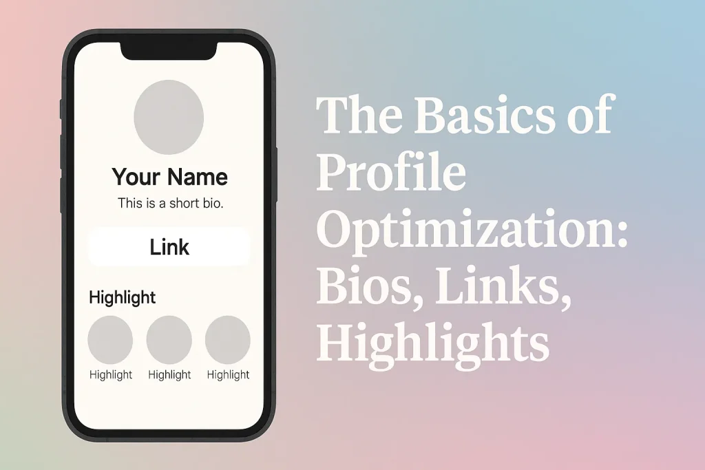
If your profile is a storefront, your bio, link, and highlights are the window display. Nail these three and you’ll turn passive scrollers into curious visitors—and visitors into fans or customers. Below is a practical guide you can implement in under an hour, plus frameworks and templates you can reuse across platforms.
What “profile optimization” really means
Optimization isn’t about tricks; it’s about clarity and friction reduction:
- Clarity: who you are, what you do, who it’s for.
- Direction: a single, obvious action to take next.
- Proof: credible signals that you’re worth the click (results, roles, press, testimonials).
Part 1 — Bios: say less, say it better
The 3-point bio formula
- Positioning: Who you are + who you help + outcome.
- Proof: numbers, brands, roles, awards, or unique methodology.
- CTA: a next step (download, book, watch, read).
Template:
[Role/Niche] helping [Audience] achieve [Outcome]. [Proof]. [CTA → link]
Examples
- Creator: Food photographer helping local cafés turn scrolls into table bookings. Shot for CityBrew & BeanLab. Grab my menu photo checklist ↓
- Local business: Physio for desk workers in Wola. Ex-national team consultant. Book a posture audit ↓
- SaaS: Email tool for small shops—send in 5 minutes, sell all week. 2,000+ stores onboard. Try the free playbook ↓
Voice & formatting tips
- Write for skimmers: short lines, strategic line breaks, light emoji only if it fits your brand.
- Front-load keywords your audience actually searches for (role, city, niche, outcome).
- Keep one CTA. Multiple CTAs = no CTA.
Common bio mistakes
- Buzzwords without outcomes (“passionate”, “disruptive”).
- No audience definition (“helping everyone”).
- Competing CTAs (“subscribe” and “book” and “shop”).
Part 2 — Links: one door, not a maze
Your link is the hand-off from attention to action. Treat it like a product page headline—clear benefit, fast load, obvious button.
Choose your structure
- Single primary link (best when you have one offer): goes straight to the page that matches your CTA.
- Link-in-bio hub (best when you publish often or have multiple offers): a minimalist page with 1–3 primary buttons and optional secondary links.
Prioritization rule: rank links by intent alignment (what your bio promises), then impact (what drives your goals), then freshness (current campaign).
Design tips for link hubs
- Above the fold: headline mirroring your bio + one hero button.
- Beneath: 2–3 secondary buttons max; add short descriptors under each.
- Keep thumbnails light; speed > decoration.
Track outcomes (basic UTM recipe)
Append labels so you’ll know what a click produced later, e.g.:?utm_source=profile&utm_medium=social&utm_campaign=sept-highlight
Part 3 — Highlights & Pinned Content: your evergreen pitch
Think of Highlights (IG) and Pinned posts (TikTok/X/LinkedIn) as your always-on onboarding. They answer: What should a new visitor see first to understand and trust you?
Five starter collections
- Start Here — intro + what to expect; 3–5 frames.
- Offer/Services — what you provide and how to get it; include “from …” pricing if relevant.
- Proof — testimonials, logos, case snippets, before/after.
- Tutorials/Guides — quick wins that demonstrate expertise.
- FAQ/Process — how it works, timelines, what’s included.
Design system
- Covers: consistent color palette + simple icons (handshake for services, star for proof, book for tutorials).
- Order matters: Start Here first; end on Offer or FAQ.
- Refresh quarterly; archive outdated launches to avoid confusion.
Pinned post strategy
- Pin your Start Here video, one flagship case study, and one current campaign. Each should echo the same CTA as your bio.
Fast 30-minute optimization sprint
Minute 0–10 — Bio
- Fill the 3-point formula.
- Insert one proof element.
- End with one CTA that matches your primary link.
Minute 10–20 — Link
- Decide: single link vs hub.
- If hub: set headline + 1 hero button + up to 2 secondary buttons.
- Append UTM tags.
Minute 20–30 — Highlights/Pins
- Create or reorder: Start Here → Proof → Offer.
- Choose 1–2 posts to pin that mirror your current CTA.
Measuring success (and iterating)
Track weekly:
- Profile → Link click-through rate (CTR): clicks ÷ profile visits. Raise this with clearer CTAs and fewer competing links.
- Link hub → Button CTR: which button gets tapped? Promote winners to the top.
- Destination outcomes: sign-ups, inquiries, add-to-cart, or watch time—whatever matches your CTA.
- Qualitative signals: replies, saves, shares, and comments that mention clarity (“Booked because your process made sense”).
Improve with simple tests:
- Swap the first line of your bio (outcome-first vs role-first).
- Reorder buttons on your link hub.
- Rotate the first Highlight cover (different icon/label) to see if open rates change.
Copy-ready bio templates
- Service provider (local):
[Profession] for [neighborhood/area]. I help [audience] fix [problem] in [timeframe]. Seen in [proof]. Book your [offer] ↓ - Educator/creator:
Bite-size [topic] for [audience] so you can [outcome]. [Proof or signature series]. Start with my [free resource] ↓ - Product/brand:
[Product] that helps [audience] [outcome] without [pain]. Trusted by [proof]. Explore the starter kit ↓
Final checklist (pin to your notes)
- Bio states who you help + outcome, includes one proof, ends with one CTA.
- Link strategy chosen; hero action matches the bio CTA; UTM tags applied.
- Highlights/pins set to Start Here → Proof → Offer.
- Review analytics weekly; change one variable at a time.
- Refresh quarterly (or after major launches).
You now have a clear, repeatable system: positioning → direction → proof, delivered through a bio that hooks, a link that converts, and highlights that onboard.